A new type of digital font buying experience
A new type of digital font buying experience
A new type of digital font buying experience
A new type of digital font buying experience
FontShop’s redesign brought the uniqueness of beautifully crafted, printed type specimen into the digital age for thousands of high quality fonts.
FontShop’s redesign brought the uniqueness of beautifully crafted, printed type specimen into the digital age for thousands of high quality fonts.
- ROLE Lead Visual Designer
- YEAR 2013–2014
- AGENCY Edenspiekermann
- WITH Katharina Birkenbach, Ivo Gabrowitsch, Spiros Martzoukos and Mike Smart
- ROLE Lead Visual Designer
- YEAR 2013–2014
- AGENCY Edenspiekermann
- WITH Katharina Birkenbach, Ivo Gabrowitsch, Spiros Martzoukos and Mike Smart
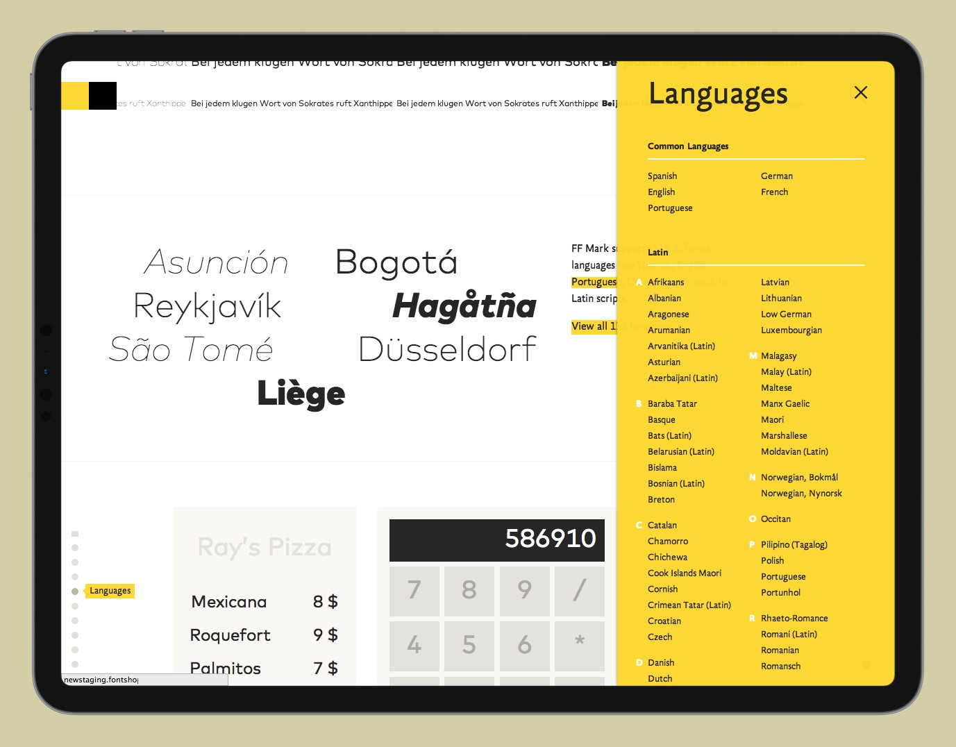
FontShop was founded back in 1989 by Joan and Erik Spiekermann in Berlin to become the first independent font distributor in the world. For its 25th birthday in 2014 they partnered with Edenspiekermann to work on their biggest shop update to date with the goal of strengthening their position as the leading distributor and becoming the best place to discover and buy new fonts from expertly curated type foundries.
FontShop plays in a two-sided marketplace. On the one side it works closely with the type foundries, which wanted their fonts to be showcased in the best possible way as well as present themselves in more expressive ways. On the other side, FontShop serves a large audience of designers that come to their site not only to purchase a font, but to browse, discover and test the latest typefaces. Both things have become increasingly hard due to complex licensing models and boring, unexciting online shops.


This relaunch set out to achieve three primary goals:
ONE
01
ONE
ONE
Simplify the buying experience.
TWO
02
TWO
TWO
Make the process of browsing through thousands of carefully curated fonts more fun and inspiring.
THREE
03
THREE
THREE
Give the people behind the fonts a platform.
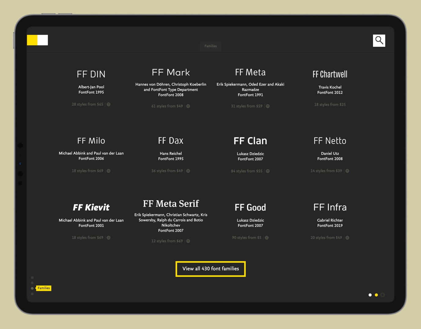
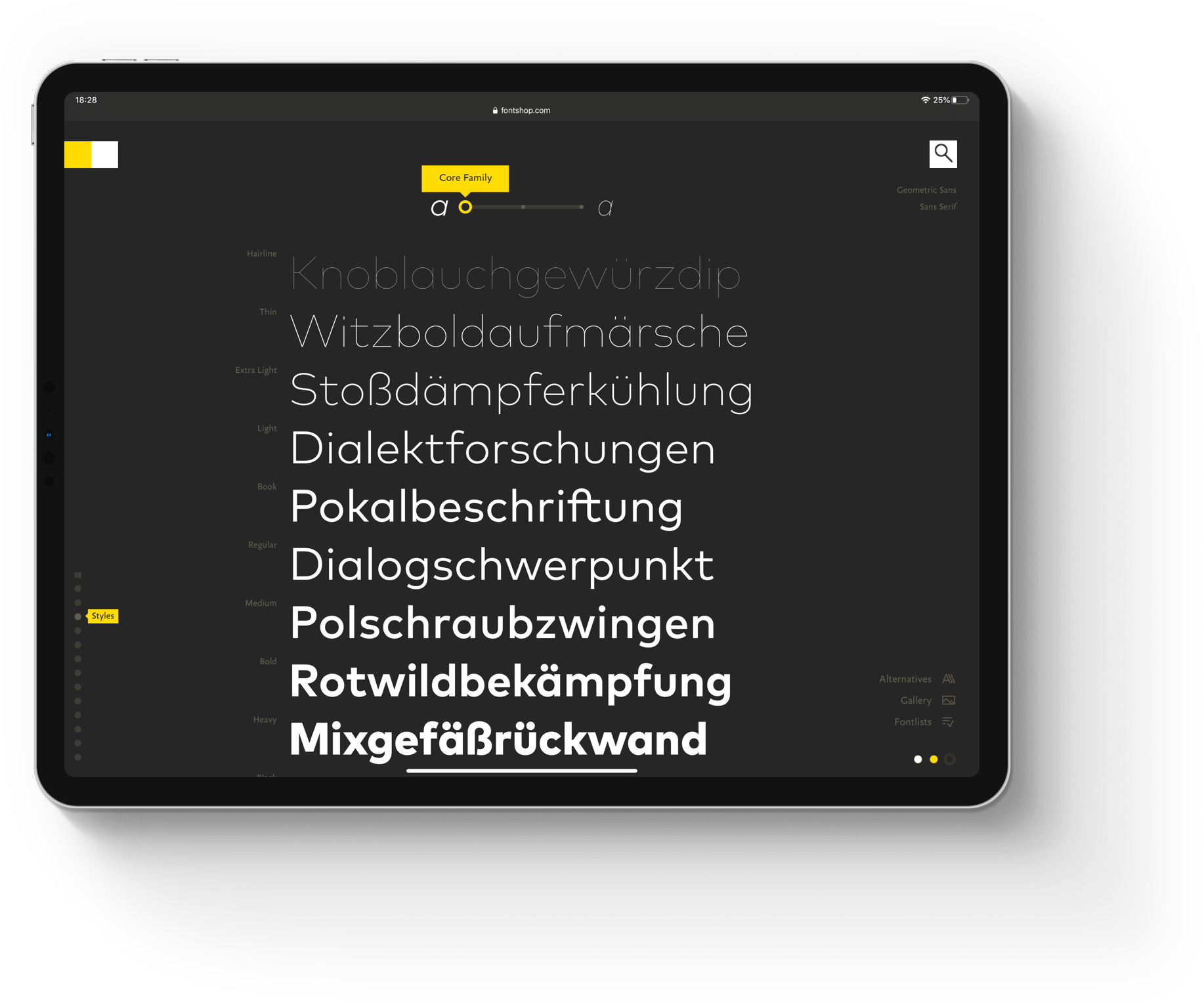
A key principle was to remove unnecessary clutter and put the focus on the typefaces themselves, allowing them to truly unfold all of their beauty. We wanted to empower people to discover and play with all their unique details and features.
THE UNIQUE CHALLENGE
How might we build a website that is capable of showing the unique characteristics of 150.000 different fonts?
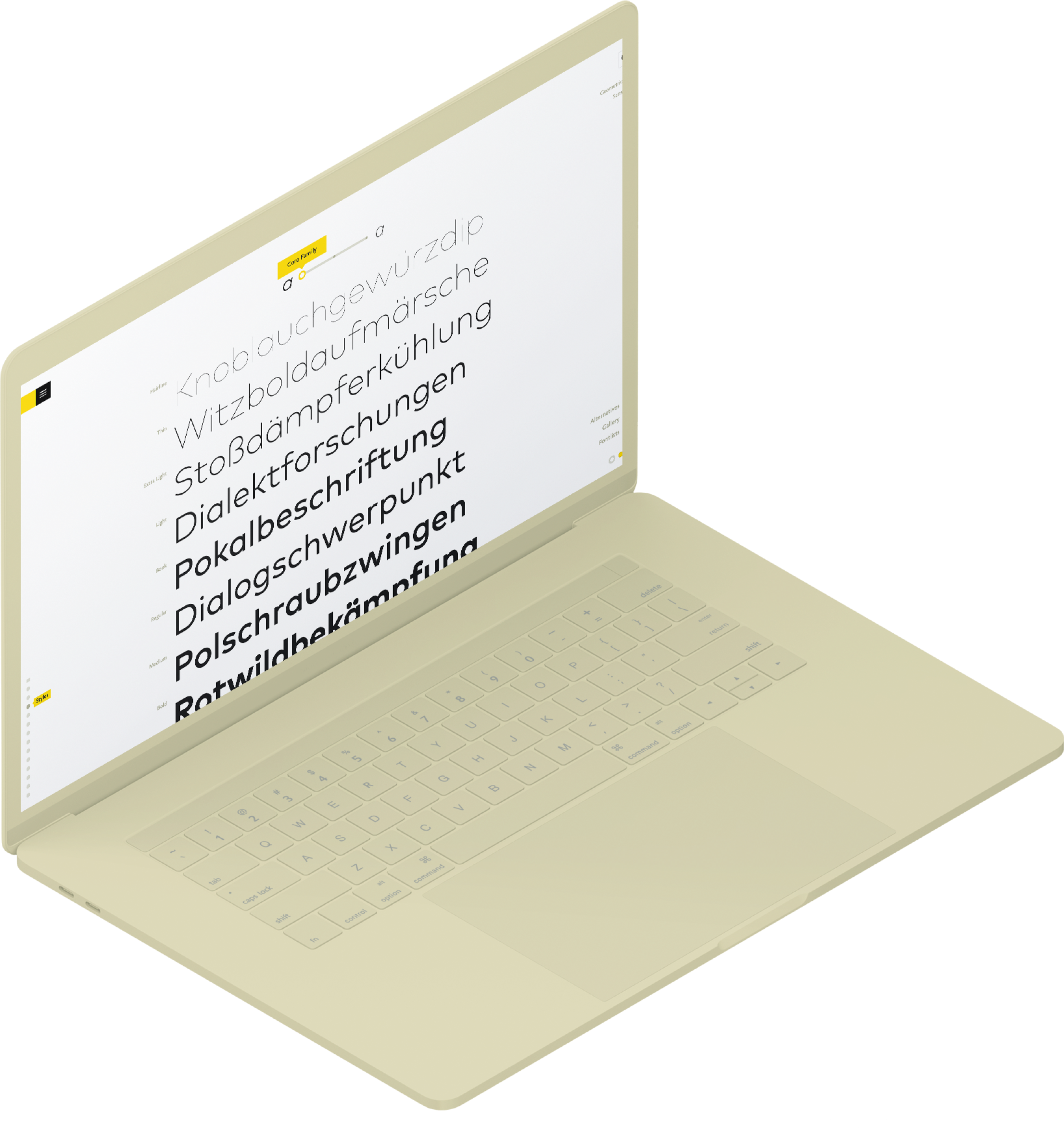
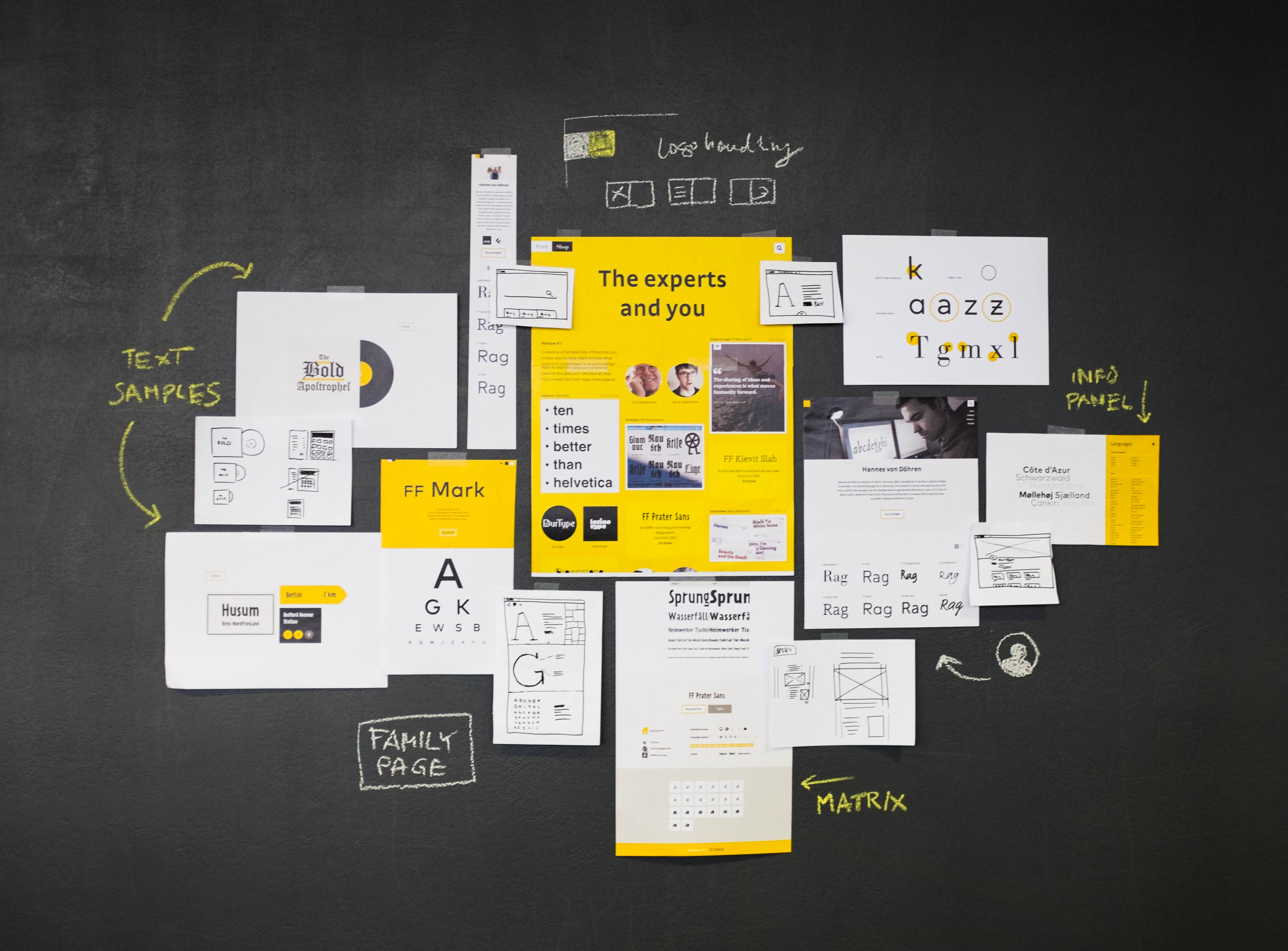
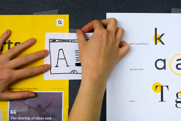
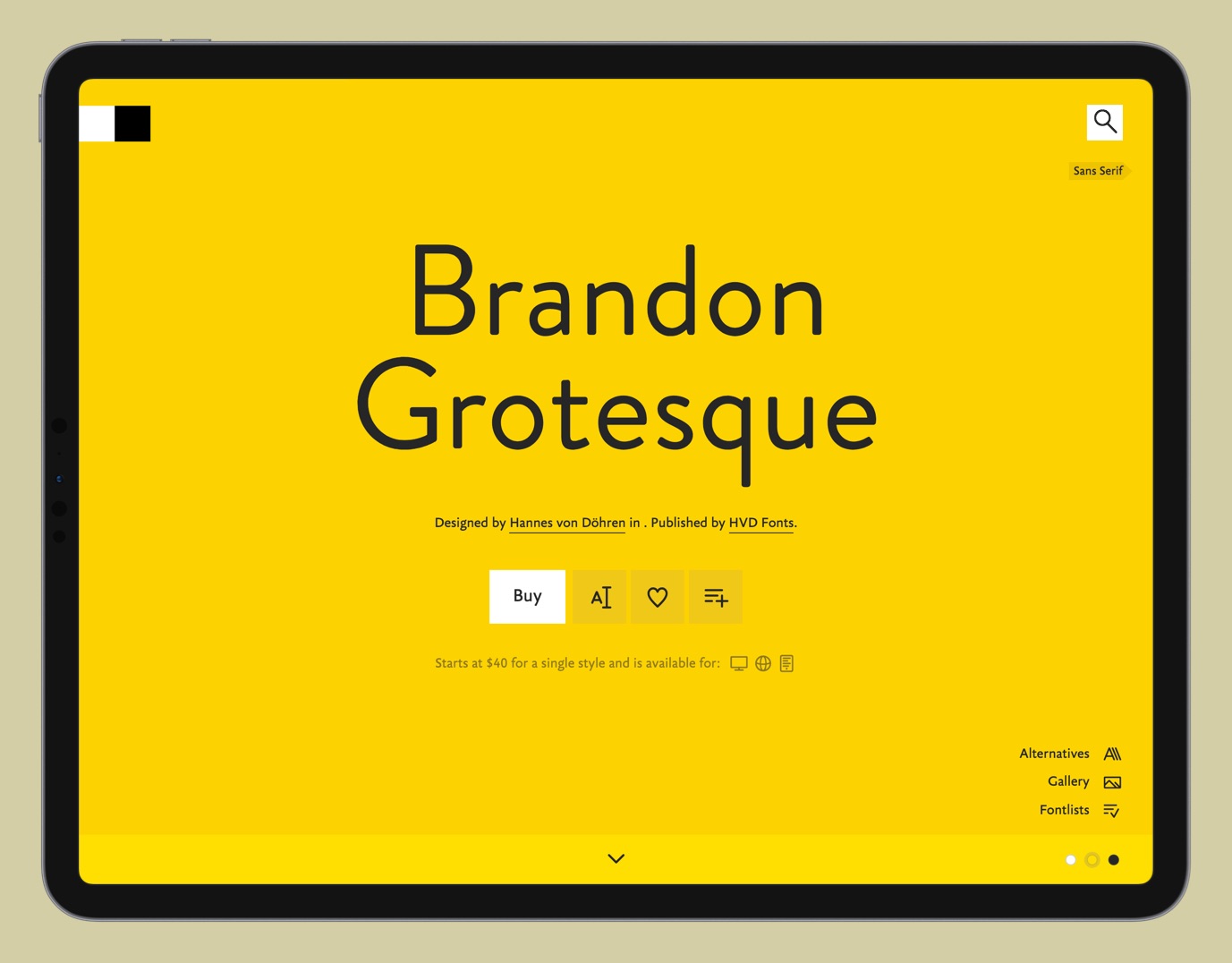
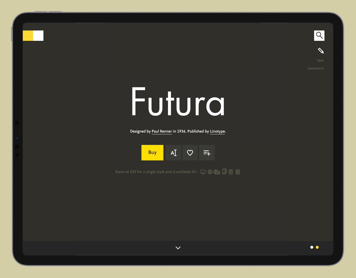
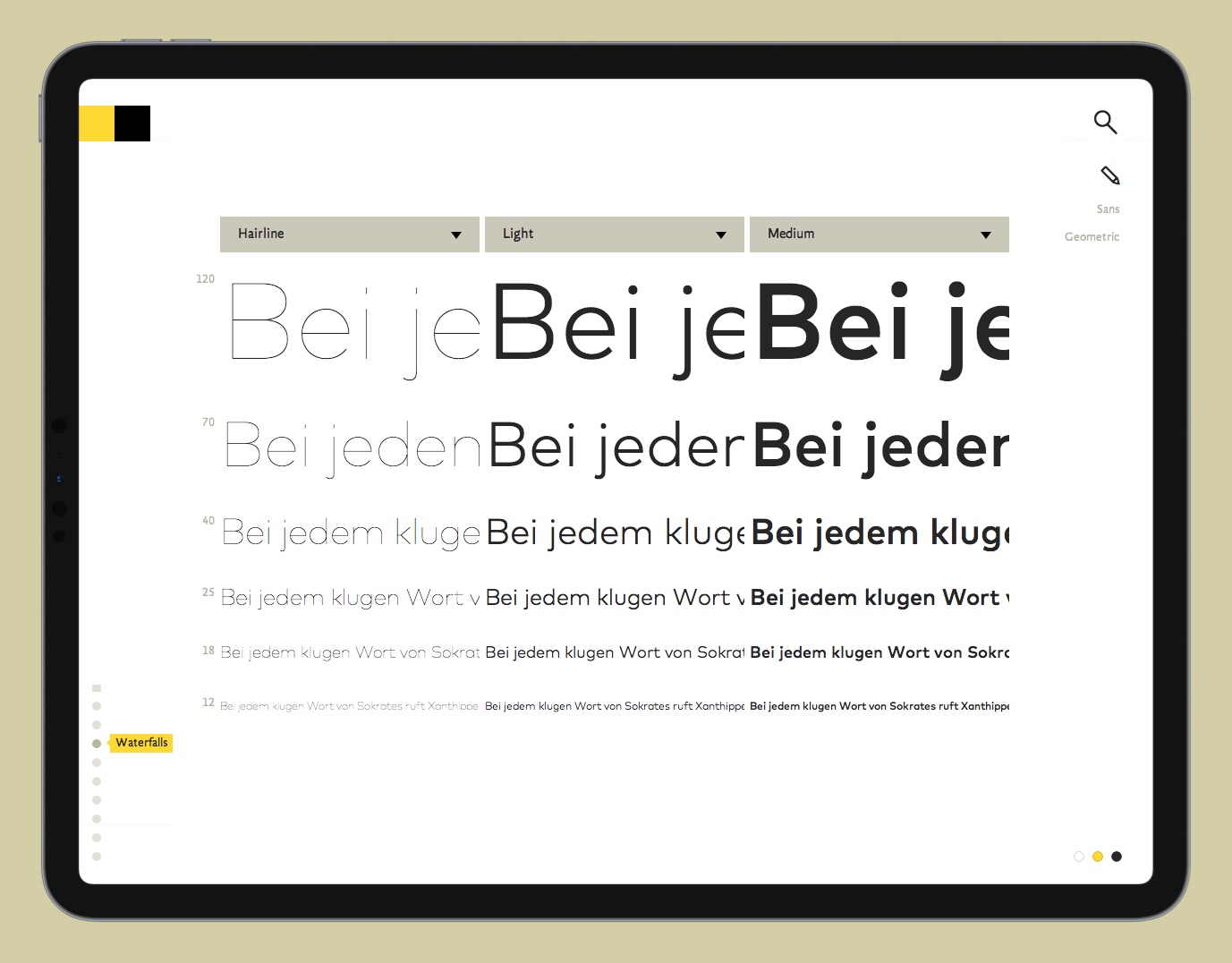
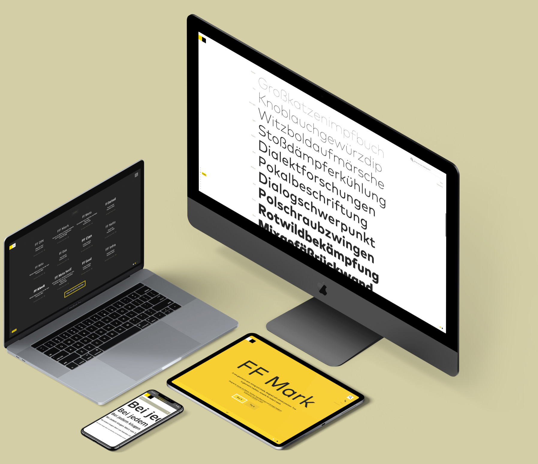
To get ahead of this challenge, we started with the heart of FontShop and built everything else around it: the font family page (in other terms, the product detail page). Foundries had started to build detailed, custom marketing websites for their new flagship fonts that allowed them to be more playful and tell a more engaging story. This, as well as the beautifully designed, printed type specimen they designed and distributed provided us with what we were looking for.
Highlights
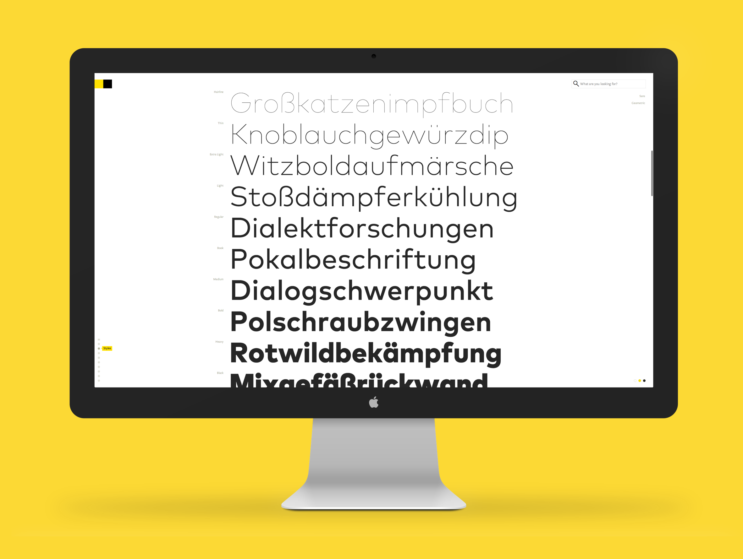
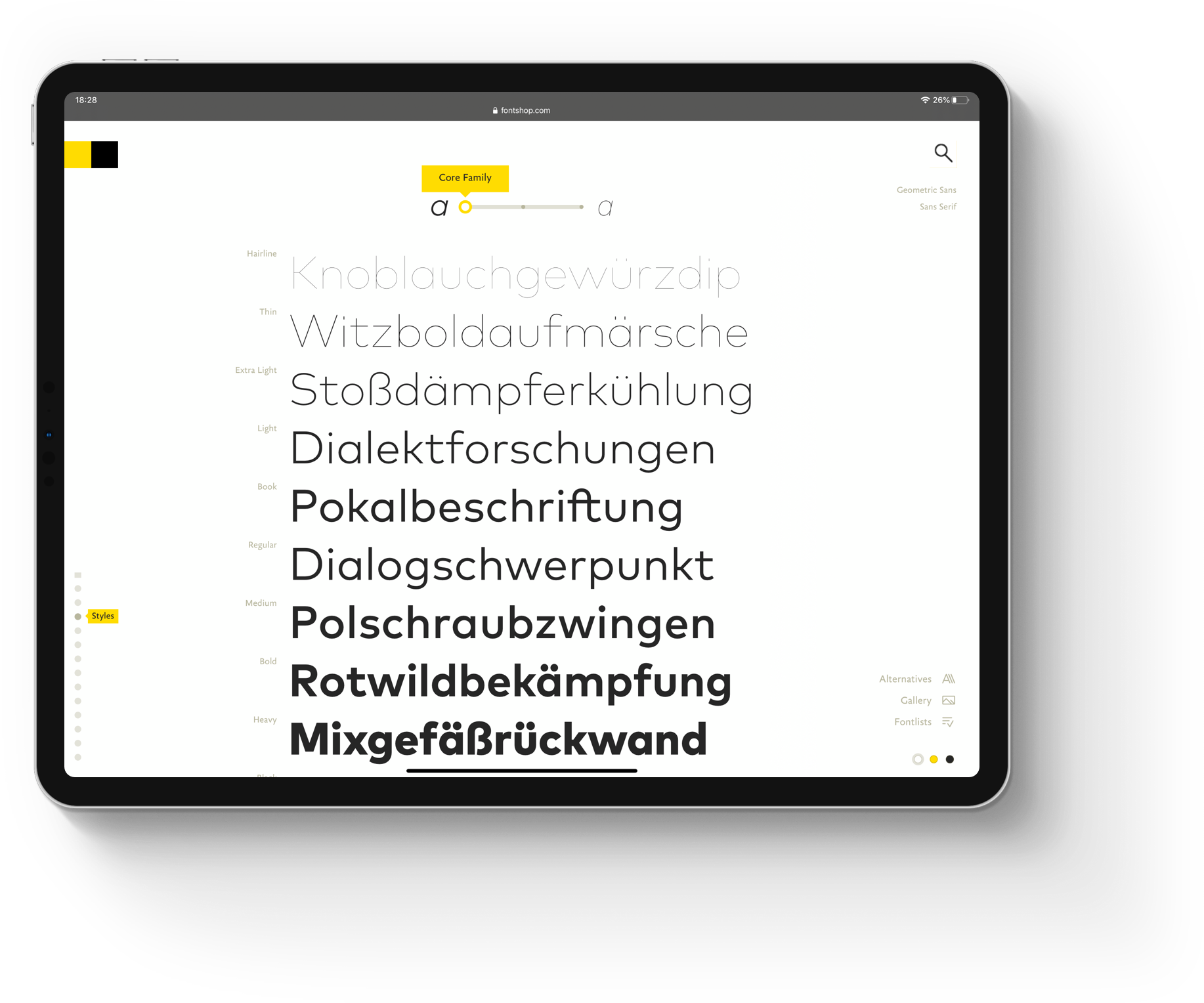
- To power our playful font family pages, we switched the entire site to web fonts! No other font distributor had done this yet, especially not at this scale. This allowed for a whole new level of interactivity, speed and visual quality.
- We created modular detail pages that allowed foundries to pick and choose from a number of practical templates and more playful components to tell their stories and show the unique characteristics.
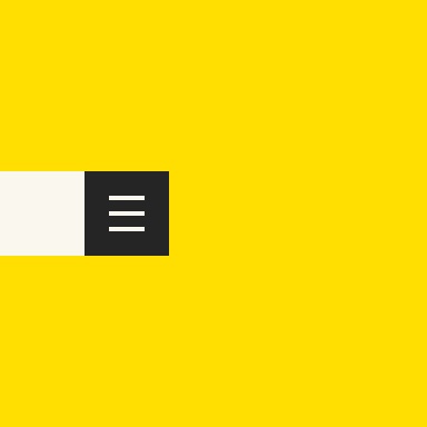
- We tried to reduce all potential distraction to a minimum. We put the navigation behind a slider to give more space to the fonts. It’s there when you need it, but gets out of the way when you don’t.
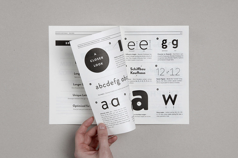
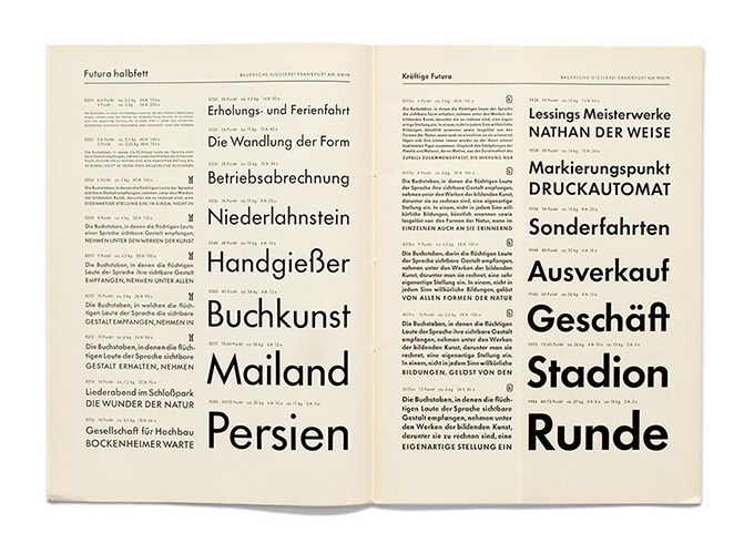
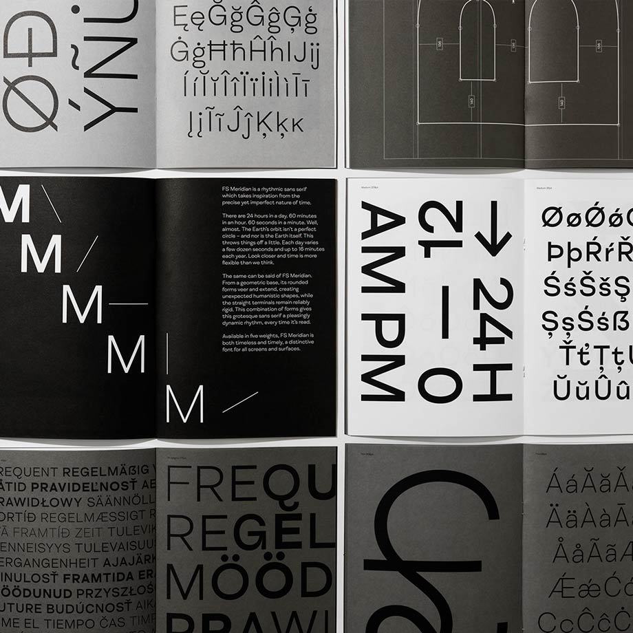
Examples of printed type specimen for Paul Renner's Futura, HvD's Brandon Grotesque and Fontsmith's FS Meridian.


Before/
After
Before/
After
Before/After
Data suggested that the majority of users were browsing the website on relatively large screens (well, they’re designers after all). The responsive website not only meant that mobile devices were supported for the first time, but finally allowed the fonts to really shine on big screens. Of course, it also made browsing through the various lists a lot easier.
(If you're not seeing a before/after below, you might need to refresh the page. Whoopsie.)
Data suggested that the majority of users were browsing the website on relatively large screens (well, they’re designers after all). The responsive website not only meant that mobile devices were supported for the first time, but finally allowed the fonts to really shine on big screens. Of course, it also made browsing through the various lists a lot easier.

Global
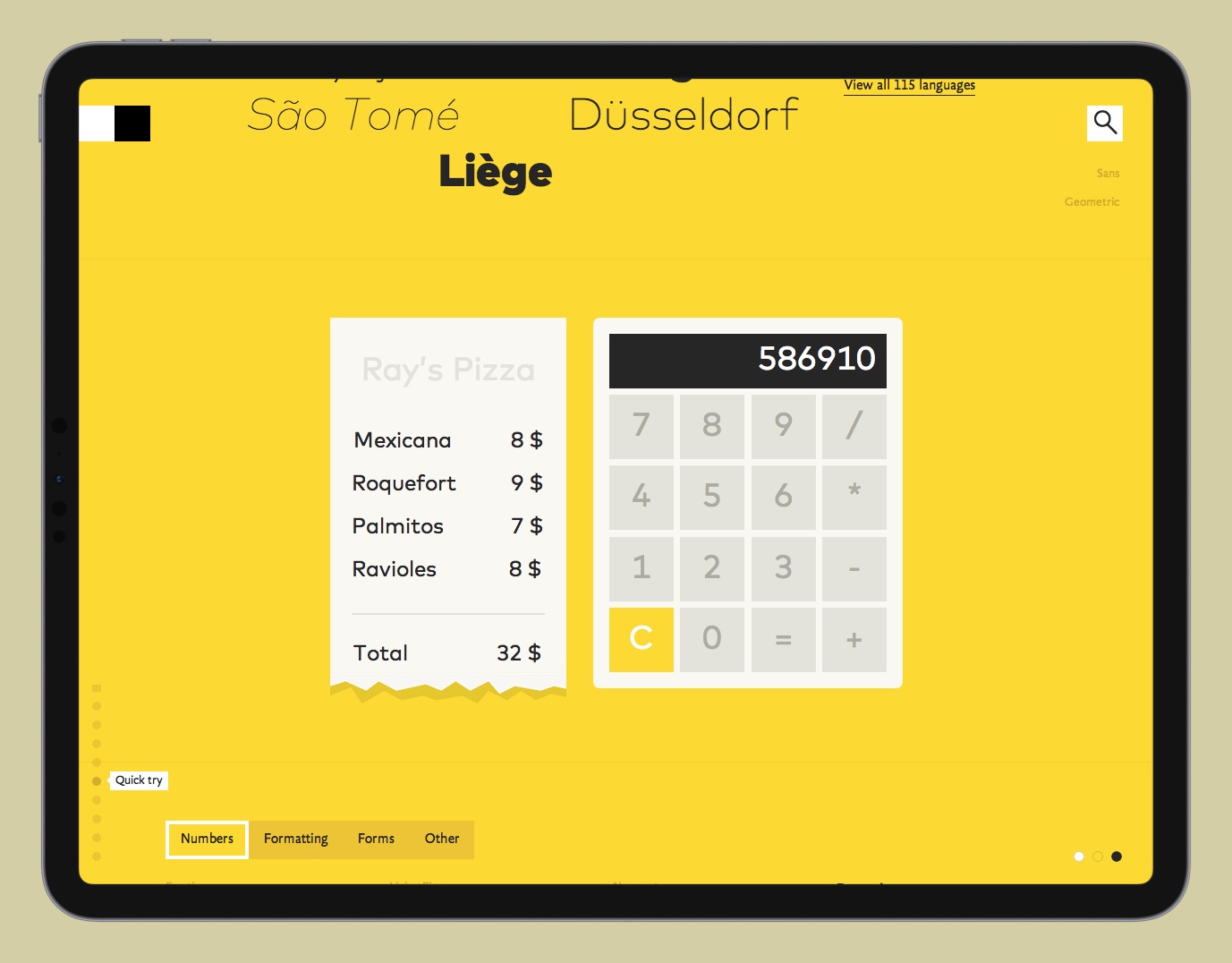
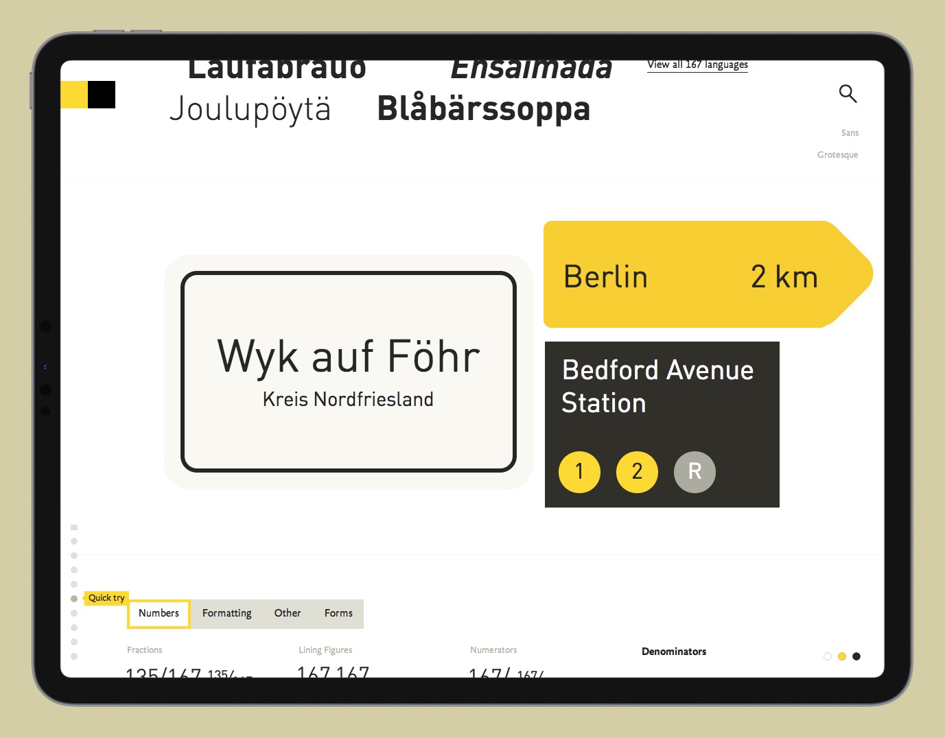
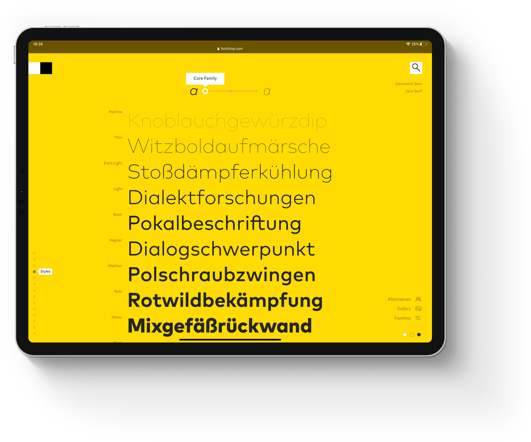
Color Switch
We also included a global color switch, which allows users to easily see positive and negative variants of the fonts.
Read more about the underlying design system that enabled this feature here. Or, just try it for yourself here.
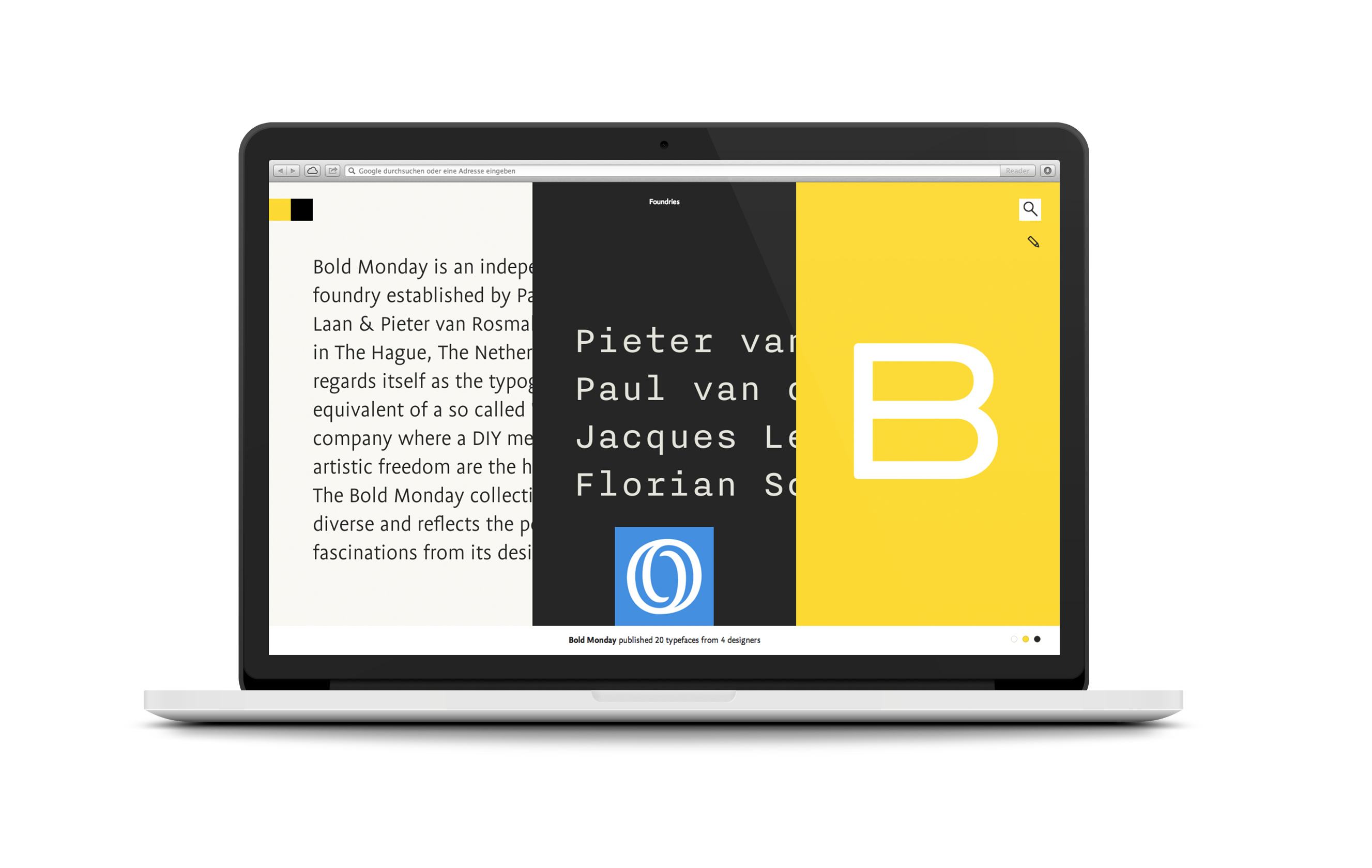

FOUNDRY
PAGES
FOUNDRY
PAGES
FOUNDRY
PAGES
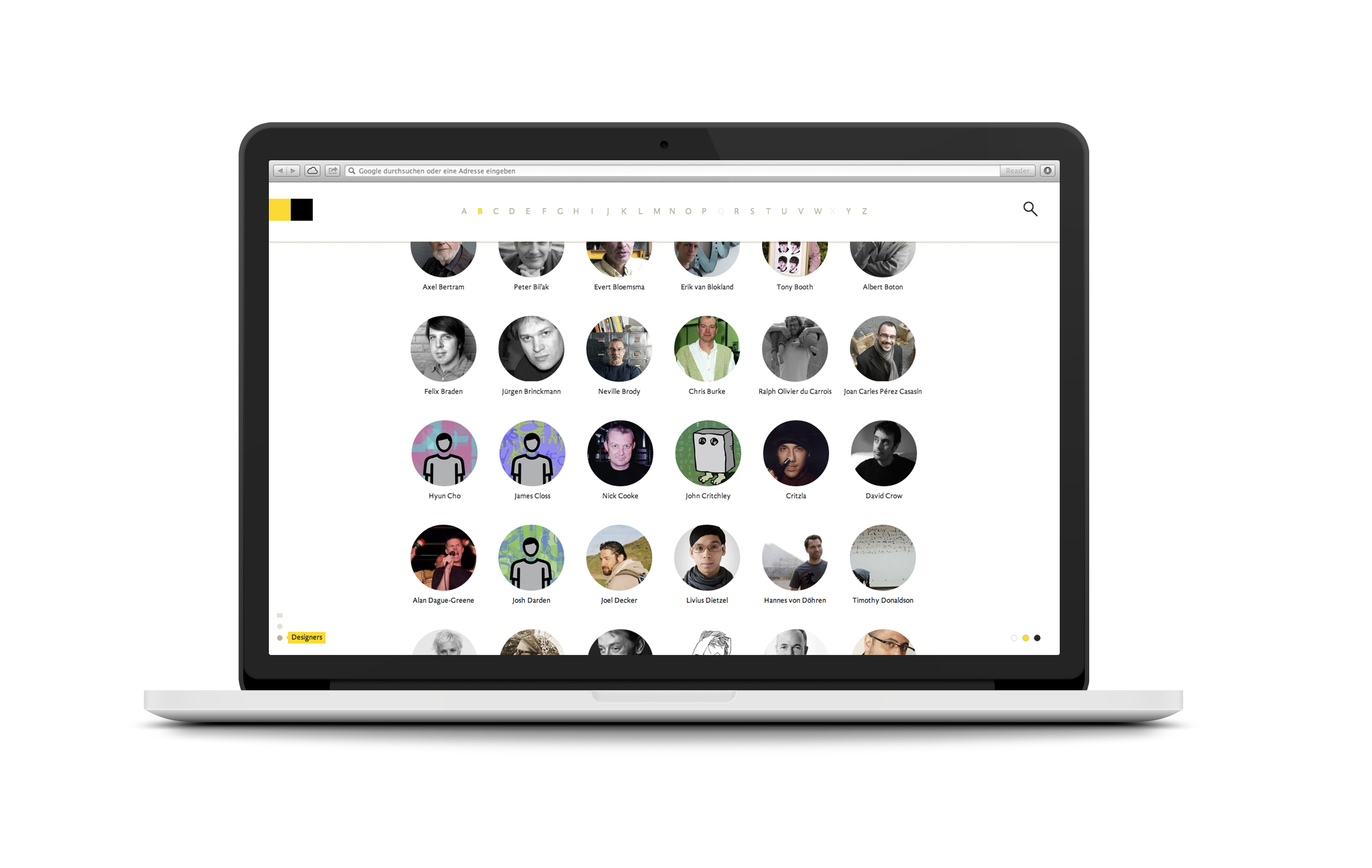
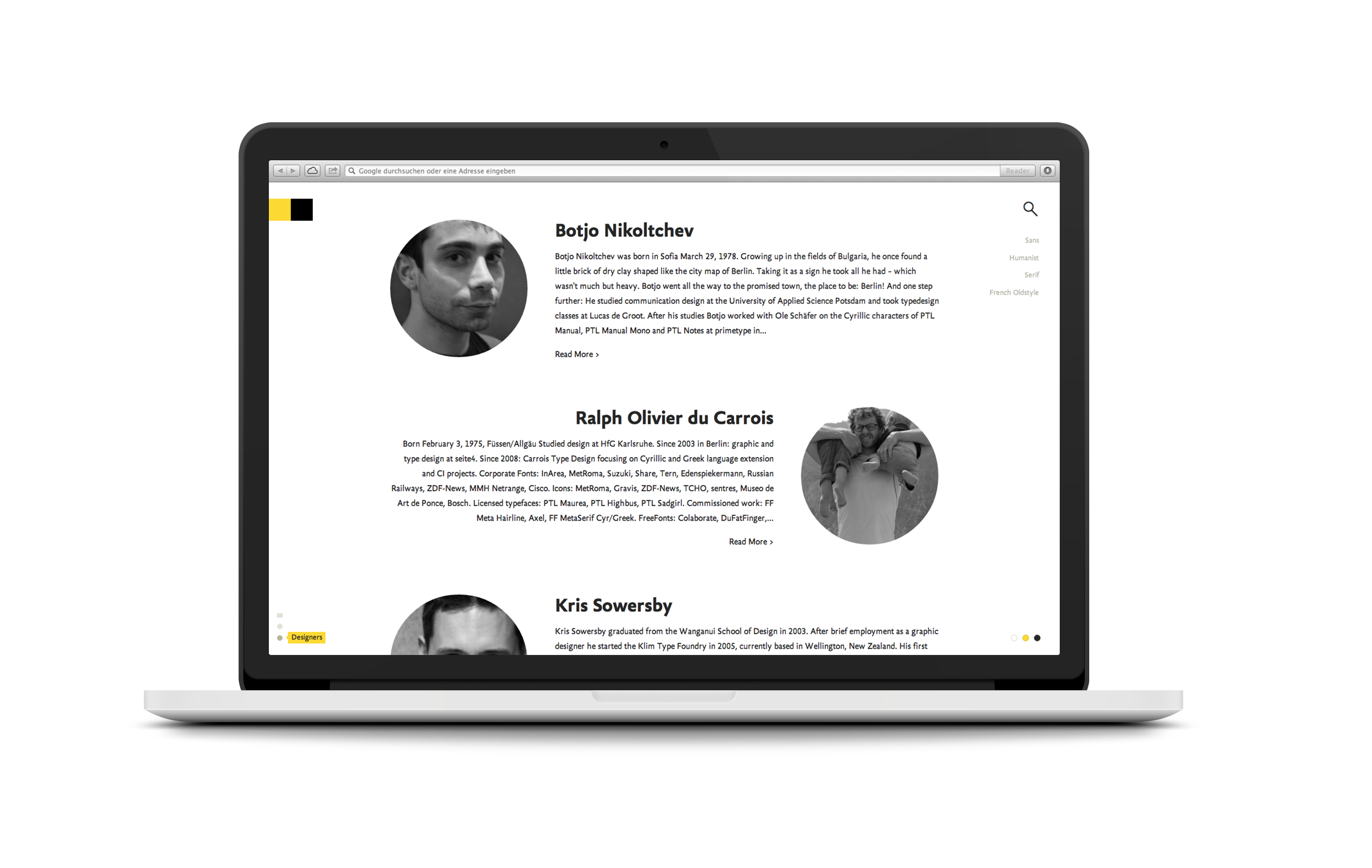
Another area of focus were the foundry pages. Here it was equally important to give foundries the freedom to customize their page to express their brand and products in unique ways. The challenge we faced here was the varying size of foundries. While some are made up of just a single or a handful designers, others consist of dozens if not hundreds of designers. Especially for the smaller foundries the individual designers play a huge role and needed to become a centerpiece of their page.
We designed the page in a way that adapts automatically to either provide a handy overview or detailed profiles that allowed for more detailed biographies and infos. The foundries' covers are auto-generated based on their most popular fonts.
For designers without profile images, we created individual faces made out of one of their own fonts to give our placeholders more character.


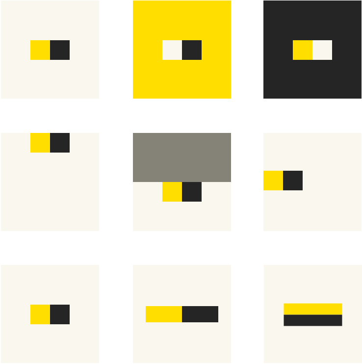
LIGHT & DARKNESS
FontShops iconic logo (representing light- and darkness) and its squares can be found in various ways across the website: the menu, card designs and headers for font lists or progress indicators.
THE OUTCOME
The new FontShop experience marked the beginning of an exciting new chapter for how fonts can be presented and distributed in the age of the internet.
FontShop's talented team of type enthusiasts have pioneered the distribution of fonts over the last decades. With the relaunch, we set out to make FontShop the most simple, most user-friendly and most inspiring font distribution platform around and with that strengthen their position of being the leading independent font distributor.
During early testing, existing FontShop's users and the broader design community alike raved about the radical relaunch, calling it "a long overdue" example. Most other distributors and foundries followed suit over the years in shifting over to the use of webfonts on their platforms, and thus making the exploration of new fonts overall easier and more fun.
"This is great. Finally bringing the web presentation up to par with the type itself."
—Henri Liriani
Both our user research and beta feedback as well as actual usage have shown that people enjoyed browsing fonts more than ever, loved playing around with all its details, and appreciated the simpler licensing options. Similarly, font foundries felt better represented than ever and stated that our relaunch "is exactly the reason why I decided against self-publishing". FontShop's relaunch was awarded with the Certificate of Typographic Excellence by the Type Directors Club in 2014, won the Gold award at the European Design Awards and was nominated for the much acclaimed Net Awards alongside the White House, Airbnb and the Guardian in the category "Redesign of the Year".
FontShop was acquired by Monotype in the same year.
Finally…
See Erik himself give a brief overview of the project including a quick demo at Beyond Tellerrand in 2014.